Why Image-Only Emails Hurt Deliverability and Performance
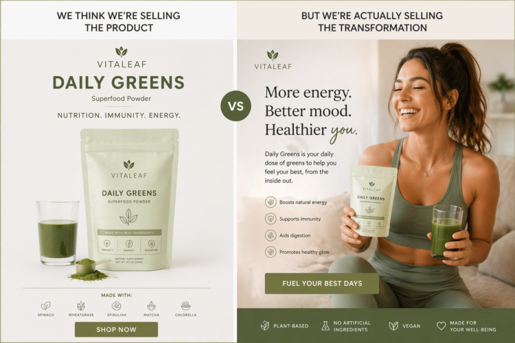
One of the most common mistakes I still see in email marketing is this: emails designed as one long image.
At first glance, it can look clean. Even premium. But from an email perspective, it is usually a weak structure.
Email is not a landing page. And it is definitely not a poster.
It is a channel where deliverability, readability, and click behavior matter more than visual perfection.
The Problem With Image-Only Emails
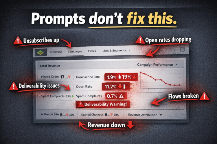
When most of an email is just one large image, several problems appear immediately.
If images are blocked, the message can almost disappear.
Inbox providers also have very little real text to read and understand. That makes it harder for them to interpret the content properly.
On top of that, the structure becomes weaker. There is less hierarchy, less scannability, and less clarity for the subscriber.
This is often where an email starts to feel more like low-quality promotional content than a real brand message.
How Inbox Providers See Your Email
A lot of designers focus mostly on visuals.
Inbox providers do not.
They pay attention to signals like structure, text-to-image balance, clarity, consistency, and legitimacy.
If those signals are weak, the email can become harder to trust and harder to place well in the inbox.
That is why good email design is not only about appearance. It is also about how the message is built underneath the design.
What Works Better in Email Design
A stronger email structure usually follows a much simpler pattern:
Text
Image
Text
Image
Text
This kind of layout helps in several ways.
It creates a clearer reading flow. It gives inbox providers more real content to process. It improves accessibility. It also makes the email easier for subscribers to scan quickly and understand.
Most importantly, it supports performance instead of getting in the way of it.
The Difference Between Design and Email Strategy
This is where the gap usually shows.
Many emails are designed by people who know visual design, but do not fully understand email deliverability or subscriber behavior.
So the email ends up looking polished, but performing poorly.
Good email design is not just about making something pretty.
It is about building something that can land well, read clearly, and drive action.
How Strong Brands Approach Email
The best brands usually do not send image-only emails that look like posters.
They send emails that are structured, readable, balanced, and easy to trust.
Their emails still look good, but they are built for the inbox first.
That is the real difference.
Beautiful matters. But readable, balanced, and deliverability-friendly matters more.
Final Thoughts
If your emails rely too heavily on images, you are making the inbox work harder and the subscriber work harder too.
A strong email should not just impress visually.
It should help the message land, be understood, and get clicked.